
 We respect your privacy. Your information is safe.
Introduction
The internal taxonomy problem that most digital estates have, and why it matters more than the design.
There is a diagnostic test we run early in every b2b website ia engagement. We look at the top-level navigation and ask: Does this reflect how the organization thinks about itself, or does it reflect how users think about what they want to do?
In most cases, the result is a classic org chart website navigation: sections correspond to internal teams, business units, or product categories. The labels are the names the organization uses internally. The structure mirrors the way ownership is divided between departments.
Users do not know any of this. They arrive with a task, a question, or a feeling, and they look for a navigation that meets them where they are. When it does not, they leave. Or they search. Or they navigate by trial and error through a structure that was not built for them.
The Taxonomy Gap
On a recent engagement, we audited a digital estate for a global brand with multiple product lines, a large membership community, and a significant B2B distribution network. Getting the website navigation b2b customer relationship right was central to the brief. The navigation had been built over several years as the organization grew, and it showed. Top-level categories corresponded to the major business divisions. Sub-navigation mirrored internal product naming conventions. The labels made perfect sense to anyone who worked there.
The research told a different story. Users described their intent in experiential terms. They wanted to do something: see something, learn something, find someone who could help them with a specific goal. They were not thinking in product categories or business divisions. They were thinking about an outcome.
What Experience-First Navigation Actually Means
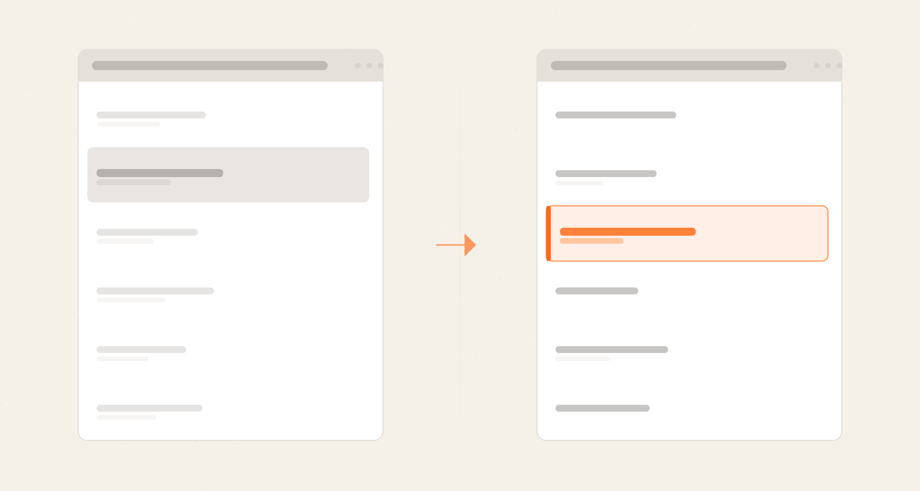
Customer centric navigation is not about removing product information from the site. It is about changing what sits at the top of the hierarchy. Instead of "Products" or "Services" or "Solutions," labels that describe what the organization offers, the navigation leads with what the user is trying to accomplish.
On the engagement we were running, this meant restructuring the customer journey navigation around three primary intents that the research had identified: people who were new to the space and exploring whether it was for them, people who were already engaged and wanted to go deeper, and people who wanted to teach or operate in the space professionally. Three fundamentally different users with fundamentally different needs, and the navigation needed to separate them at the top, not three levels in.
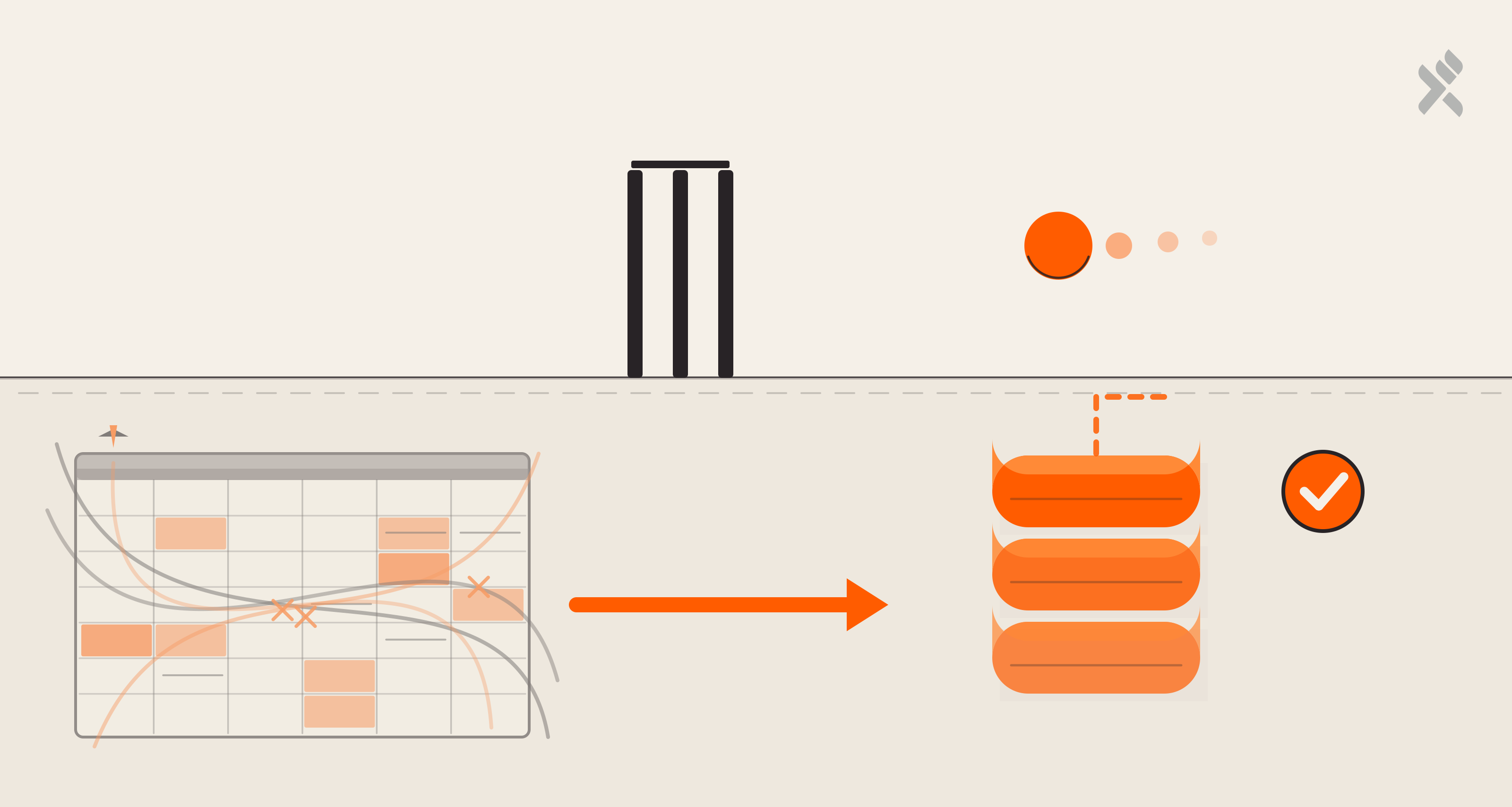
The product and service content did not go away. It moved. Instead of being the primary organizing principle, it became accessible within each intent-based section, surfacing as the "how" once the "what" had been established.
The Hidden Cost Of Org-Chart Navigation
Beyond the user experience issue, there is a real conversion cost to navigation that reflects the organization rather than the user. When users cannot quickly orient themselves to the right section of a site, they rely more heavily on search, on direct links from external sources, and on trying multiple paths before finding what they need.
Each of these behaviors is more fragile than a navigation that works on first contact. A user who finds what they need through search is one broken search experience away from leaving. A user who navigates successfully through a well-structured IA develops a mental model of the site that makes every subsequent visit faster.
There is also a content investment argument. Organizations spend significant time and budget creating content that then sits in a section of the site that users do not intuitively reach. The content exists, but the findability does not. A taxonomy change, without any new content, can meaningfully increase the reach of what is already there.
Where To Start
The most useful starting point is not a navigation audit. It is user intent research. Understanding the verbs, the things users are trying to do, before redesigning the structure that is supposed to help them do those things.
The question to bring into that research is rooted in jobs to be done navigation thinking: not "how do users describe our products?" but "what are users trying to accomplish when they come to us?" Those are different questions, and they produce different answers. The second answer is the one that should drive the taxonomy.
It is slower to start this way. It requires stakeholder alignment across teams who each have a stake in where their content sits in the hierarchy. But the alternative, designing a navigation that serves the organization's self-image rather than the user's goal, is a pattern we see repeatedly, and it is consistently one of the highest-impact things a digital estate can fix.
If your navigation is built around how your organization is structured rather than what your users are trying to do, we can help you change that.
FAQ'S

Dheeraj Khindri, Director of Experience Design
A pragmatic soul and cinema enthusiast who enjoys larger-than-life films—that’s Dheeraj. In his free time, he explores all things poetry, solo guitar sessions, and binge-worthy web series. His life’s essential values? Empathy, autonomy, and pragmatism.

Leave us a comment